General
Hover Lead Forms are responsive and designed to work smoothly on any device, they can show up in different layouts, skins and colors to match their hosting web pages, and they can be customized to collect different types of user inputs.

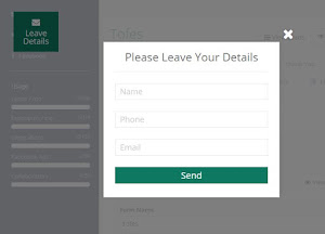
Collapsible
Forms can be configured to be collapsible, meaning that they can have a closed or opened state.
A form in a close state will be displayed as a floating badge on the hosting page, or as a sticky strip on the top or at the bottom of the user’s browser. Forms can be configured to start their first load in a closed or opened state, while users can toggle between those two by clicking on the form CTA Badge or CTA Strip.
Floating VS Inline
Floating forms are the best choice when you do not want to be dependent on the page’s format or structure.
It enables you to change your web page design without touching the leads engine
Floating forms also have a CTA (Call to Action) Badge or Strip that can be used when the form is in a closed
Inline forms should be used when you want to display a form inside a dedicated space on your web page.
Inline forms are “injected” right into a selected area on a web page and depends on their container’s dimensions and behavior.

Timing
Hover Lead Forms can be displayed to users on different timing:
- When a page is loaded – default
- After a number of seconds – best when you want to focus the user’s attention before suggesting that he enters his details
- When scrolling to a specific place on the page – best when the form is relevant to a section
- When a user tries to exit the page – usually used to suggest a last offer before leaving
- When clicking on an element – when you want to hide the form until the user clicks on it
Note – forms can be displayed in an open or closed state regardless of the timing configuration.
For more information see Hover Lead Forms – Overview